Zur Farbenlehre Colour and Background (after Goethe)
2011
photography by Johannes Schwartz at the Goethe-Institut Amsterdam, 2013
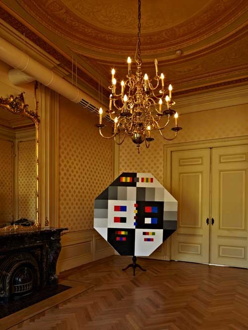
Zur Farbenlehre, Colour and Background, (after J.W. von Goethe) (2011)
Oil paint on linen, wood and glass prism, 2.4m(h) x 2m(w)
The model
Zur Farbenlehre, Colour and Background, 2011 by Sara van der Heide is an enlarged copy of one of the three folded, standing table-screens, developed by J.W. von Goethe in 1805 to demonstrate his theory of light and colour to the circle of female friends around Duchess Luise. The composition and primary colours of
Zur Farbenlehre bring to mind early 20th century abstract painting, such as Mondriaan’s geometric compositions. But
Zur Farbenlehre was developed at the beginning of the 19th century, in response to Sir Isaac Newton’s much earlier discovery of white light being a combination of all the colours on the light spectrum. Goethe took a more contextual approach, providing a catalogue of how colour is perceived in a wide variety of circumstances, for example, against different background colours. This reference to 19th century science and aesthetics offers a poignant reminder to the influence of (rational) Enlightenment thinking on our own contemporary perceptions of the world. We are still taught to perceive and organize the world through this Eurocentric prism; culturally informed knowledge determines the spectrum of colours visible to our eyes and mind.
After seeing the work of Van der Heide in 2011 the question there for could be what was the influence of Goethe on the mental legacy and the way of working of Piet Mondriaan? And how far is Mondriaan indebted to Goethe if one thinks about for example Victory Boogie Woogie (1942-1944) or Lozenge (1921)?